UNIMEDINOR

Project Overview
A small clinic in coastal Ecuador was running on WhatsApp. Patients texted the manager directly to ask about services, doctors, and appointments. It worked, barely, but it didn't scale and it burned out the staff.
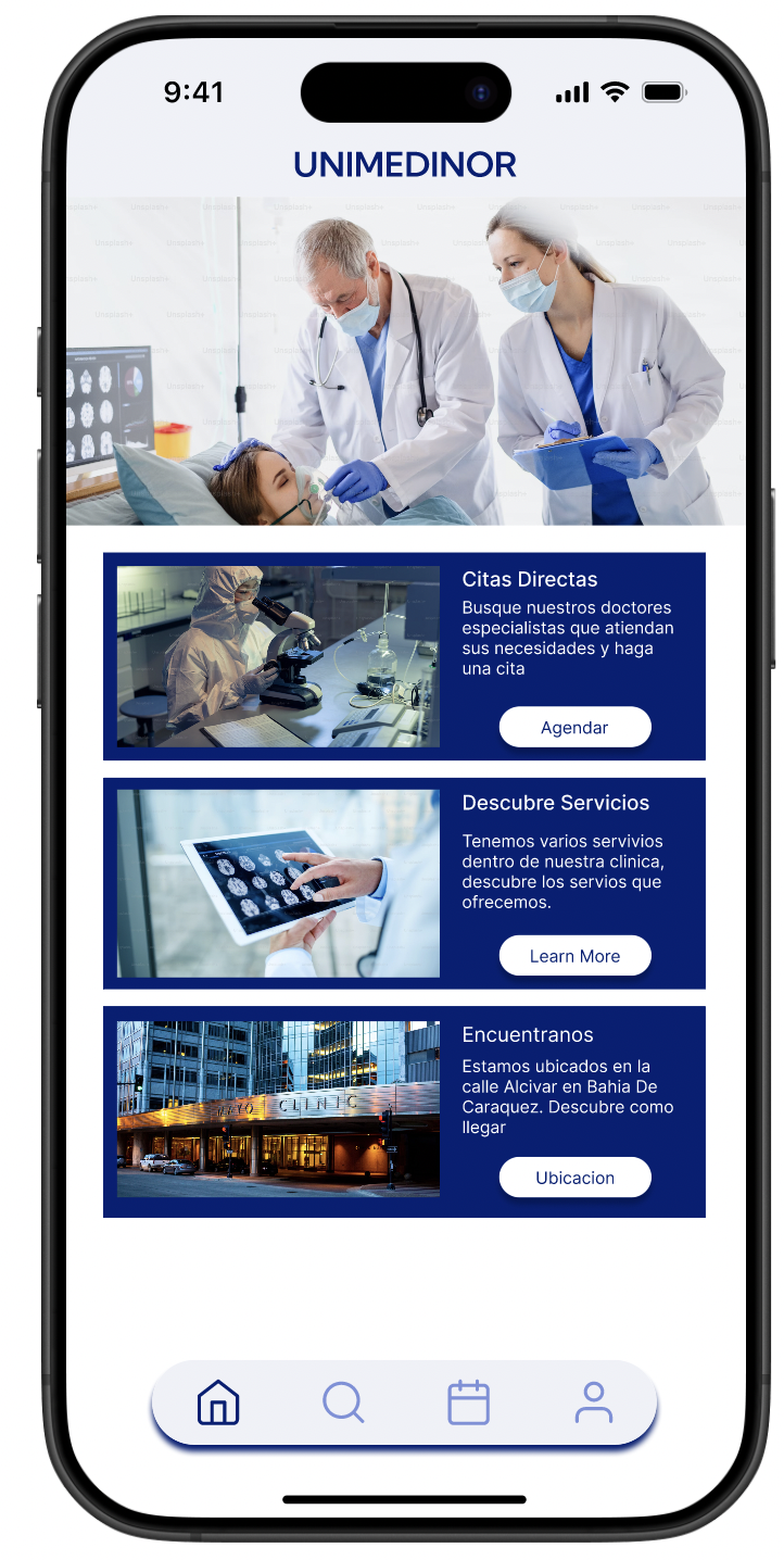
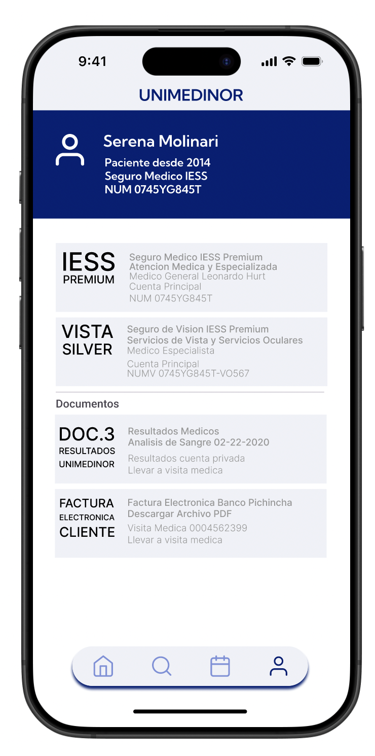
The Product A mobile app and responsive website for UNIMEDINOR Clinic, designed to help patients explore medical services, view doctor profiles, check availability, and book appointments.
The Problem No central platform existed for patients to find services, check doctor availability, or book appointments efficiently, making the process slow and frustrating for both patients and staff.
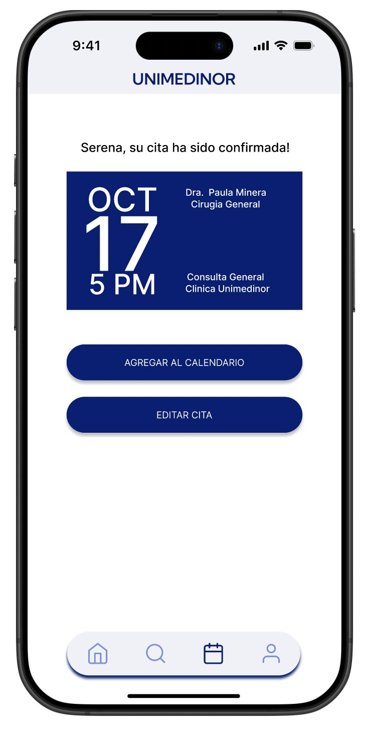
The Goal Design a single platform where patients could find doctors, check availability, and book appointments without a phone call or walk-in visit.
Project Duration April 2024 - October 2024
User Research
I went in assuming the challenge was a standard UX problem: people needed a better booking flow. The research told a different story.
The clinic is in a small coastal town in Ecuador where Wi-Fi is inconsistent and most patients only use a handful of apps. Digital booking wasn't part of their routine. Many preferred walking in, and those who had questions texted the clinic manager directly because that felt more human and reliable than any system.
The real design challenge wasn't just functionality. It was trust, familiarity, and meeting people where they actually were, not where I assumed they'd be.
Key Insights
Assumptions about universal digital behavior don't apply everywhere. Context changes everything.
Limited digital literacy was a major barrier, not a minor consideration.
Patients trusted personal communication over any digital system, so the design had to feel approachable, not clinical.
Understanding the User
User Research: Pain Points
1
Connectivity and Digital Literacy Barriers
Limited Wi-Fi availability in the town and limited familiarity with apps and appointment booking procedures.
2
Outdated communication Systems
Outdated system, clients text to ask clinics information as there is no information available online.
3
Need for human interaction
Preference to see walk in schedule instead of booking appointments.
4
No Online Access to Clinic Services or Availability
There is no information available online to tourist, clients would have to walk in the clinic to get informed about services and doctors availability
User Persona

Age 39
Education Bachelors Degree
Hometown Bahia, Ecuador
Family Married, 1 Kid
Occupation Clinic Manager
Pedro
“As the manager and main point of contact, I spend most of my day replying to clients texts about available services ”
Goals
Make clinic information accessible online so patients can help themselves.
Reduce the volume of personal messages he receives daily.
Have a larger impact on the clinic's success and growth.
Frustrations
Spends too much time answering the same questions repeatedly.
No platform exists to share this information at scale.
Feels the clinic is losing patients because information is so hard to find.
Pedro is the unofficial help desk of the clinic. Every question a patient has, every service inquiry, every appointment request, lands in his personal messages. He spends hours a day doing work that a platform should be doing. He doesn't need more features. He needs the information to exist somewhere other than his phone.
User Persona
Mariana
Age 24
Education University Student
Hometown Bahia, Ecuador
Family Single Mother of 1
Occupation Student
“I trust the doctors at this clinic, I delivered my baby here and hope that this is where I can come to when in need”
Goals
Check doctor availability and services before leaving home.
Understand costs upfront so there are no surprises.
Spend less time away from her child.
Frustrations
Has to show up in person just to find out if a doctor is available.
Doesn't know service costs until she's already at the clinic.
Prefers one trusted doctor but has no way to check their schedule.
Mariana trusts this clinic. She delivered her baby here. But she often shows up without an appointment, hoping a doctor is available, because she has no way to check ahead of time. She can't afford to waste a trip, and she can't leave her child for long. She needs clarity: what's available, what it costs, and whether she can get in today.

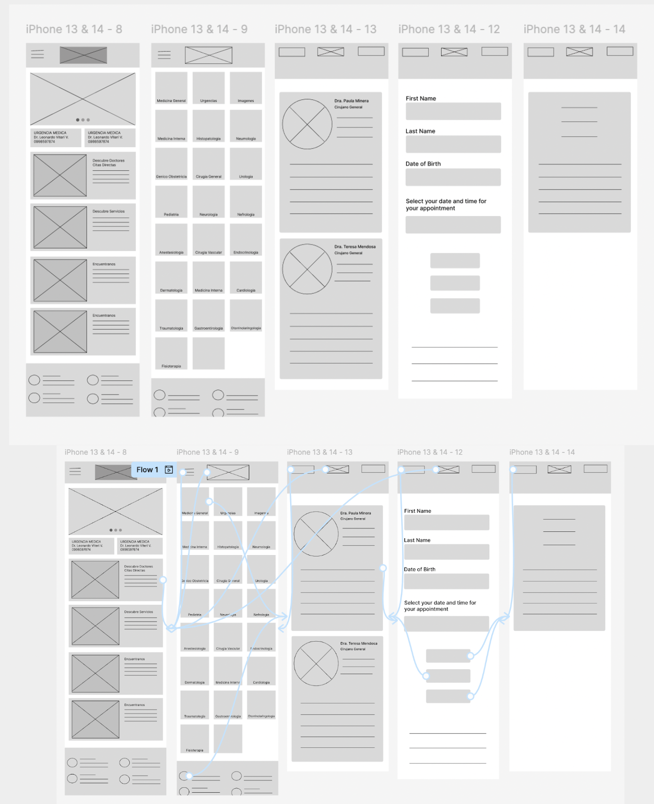
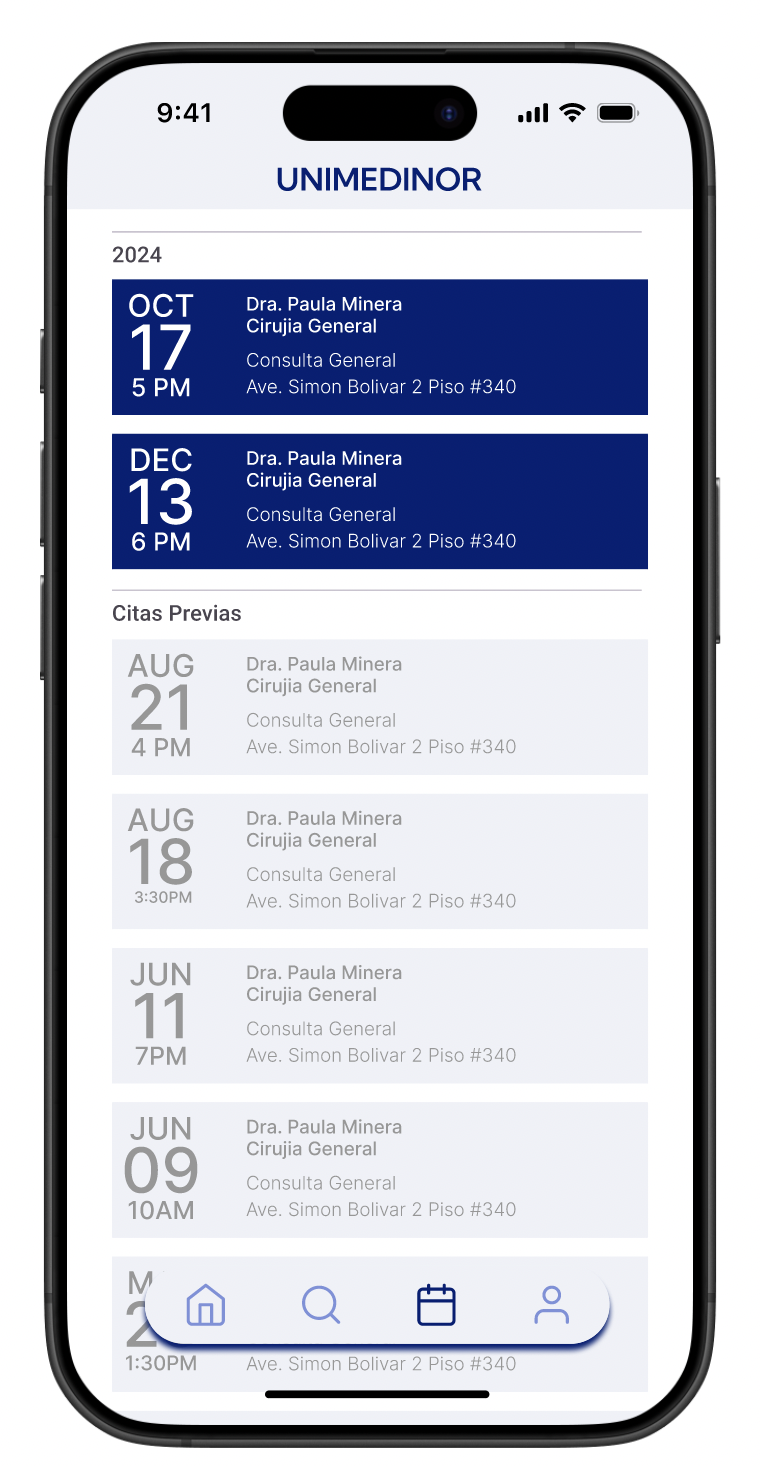
User Journey Map
Mariana's journey map traces her experience from realizing she needs a doctor to successfully booking an appointment through the app. It highlights where frustration peaks, where trust needs to be built, and where the design has the biggest opportunity to make her feel confident and in control.

Sitemap
Before jumping into wireframes, I mapped out the full structure of the app. The goal was to make sure every piece of information a patient might need, services, doctors, availability, location, had a clear and logical home. This became the foundation every design decision was built on.

Paper Wireframes
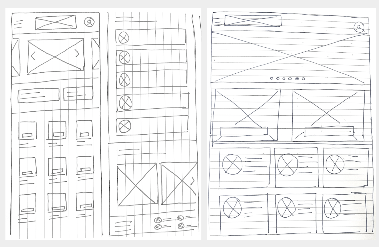
I started with paper to move fast and think freely. The priority was making sure a user could get from the homepage to the information they needed in as few steps as possible, whether that was finding a doctor, checking walk-in hours, or booking an appointment.
Screen Size Variations
From the start I designed for multiple screen sizes, phone, tablet, and desktop. Given that many patients in the town access the internet through shared or older devices, making sure the experience worked across all sizes wasn't an afterthought. It was a requirement.
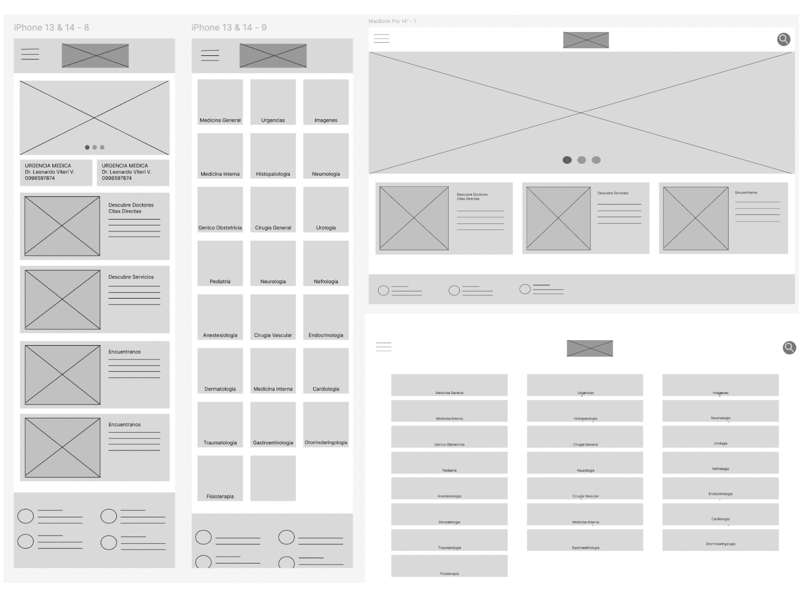
Digital Wireframes
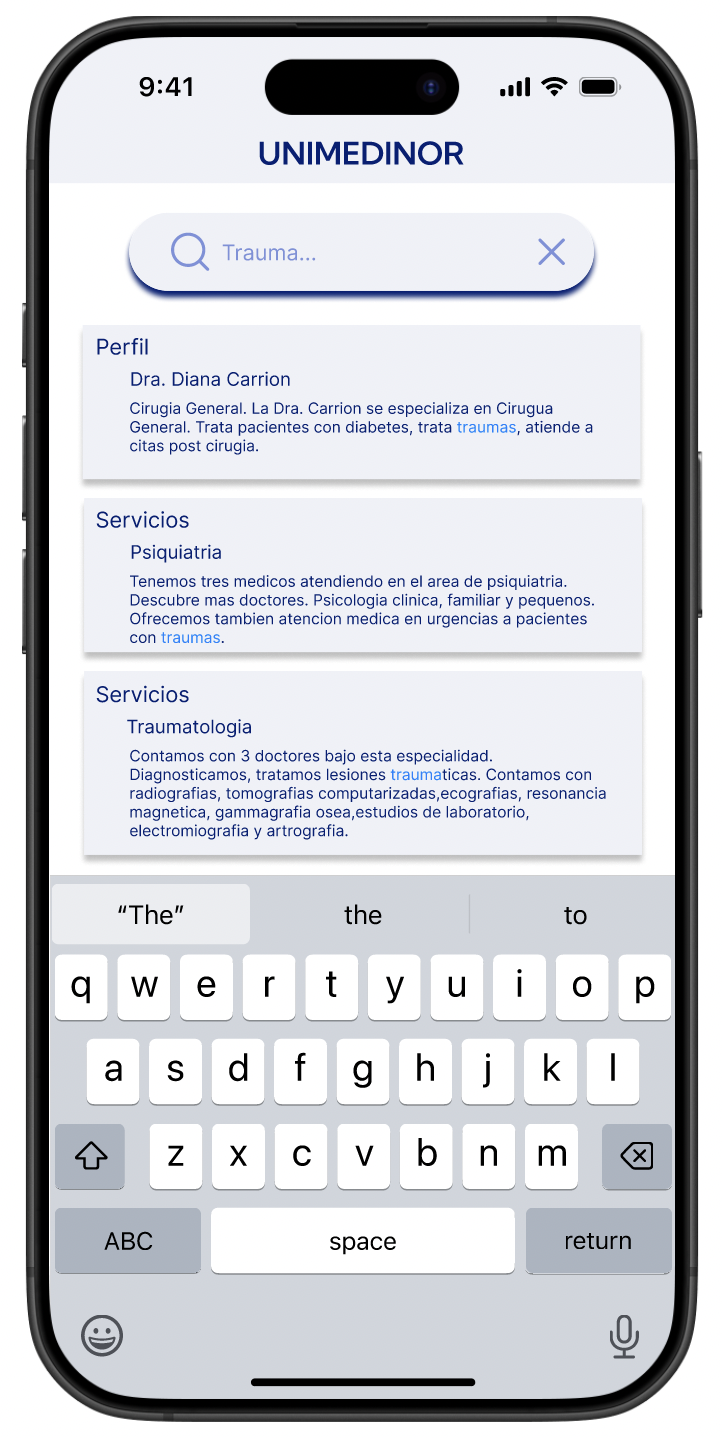
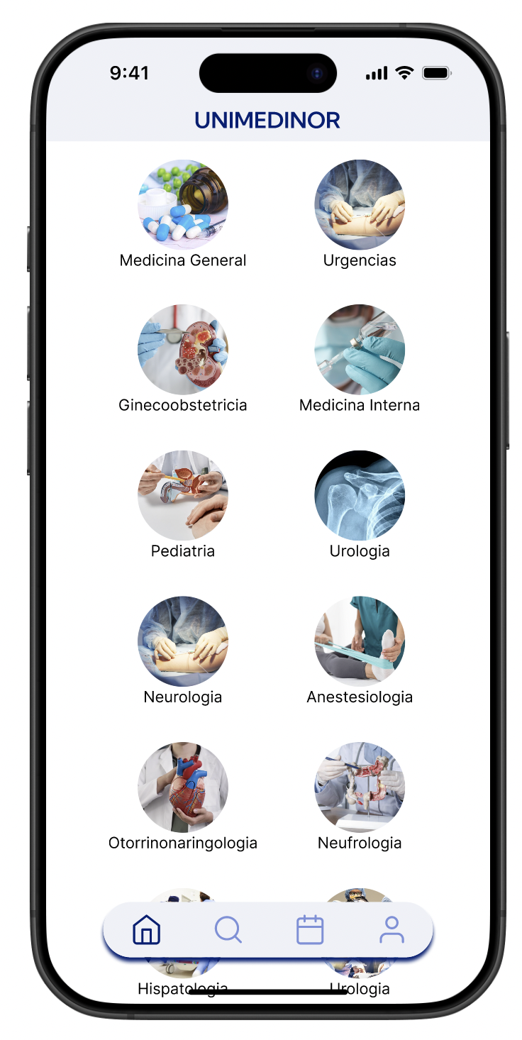
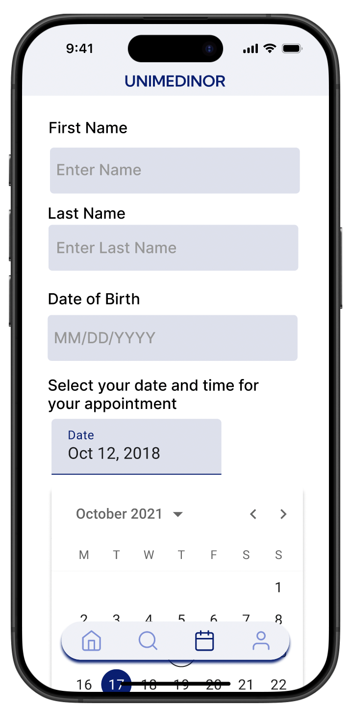
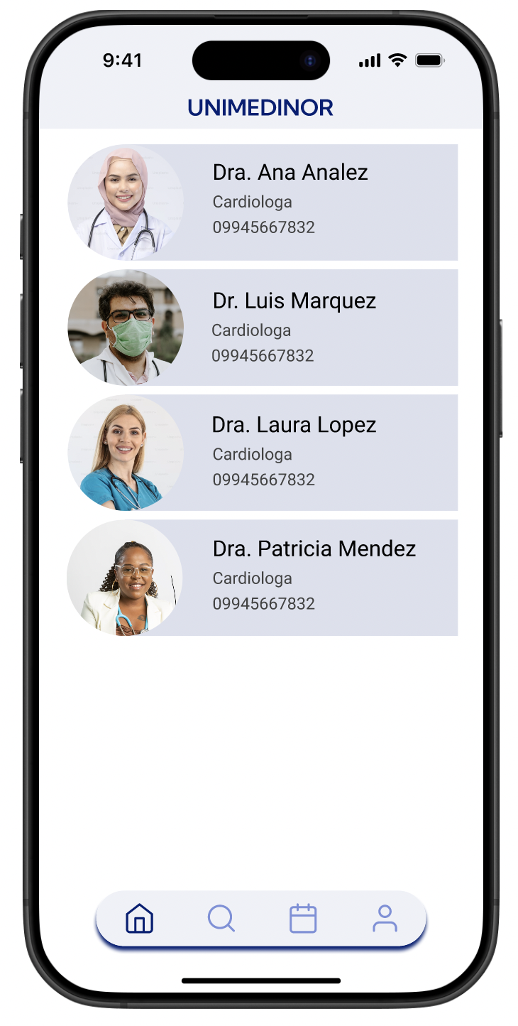
With the structure defined, I moved into digital wireframes. One of the key decisions here was how patients would search for a doctor. Research showed three distinct ways people looked: by specialty, by name, and by ranking. So I designed for all three, giving users the flexibility to find who they were looking for in whatever way felt natural to them.
Low Fidelity Prototypes
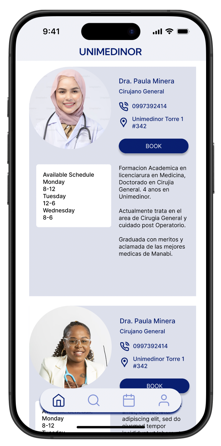
The first round of feedback was clear: patients wanted to see faces. Doctor photos next to their profiles made the experience feel more familiar and less clinical, which mattered a lot for a community where personal trust drives healthcare decisions. I also restructured the layout into a grid of smaller cards, making it faster to browse without feeling overwhelmed
Usability Study: Paramenters
Study type: Unmoderated usability study
Location: United States, remote
Participants: 5 participants
Length: 20-30 minutes
Usability Studies Findings
1
Patients wanted to see doctor photos next to their profiles. Many had visited the clinic before but couldn't match names to faces.
2
With over 30 specializations listed, users felt overwhelmed. They needed filters and alphabetical organization to navigate efficiently.
3
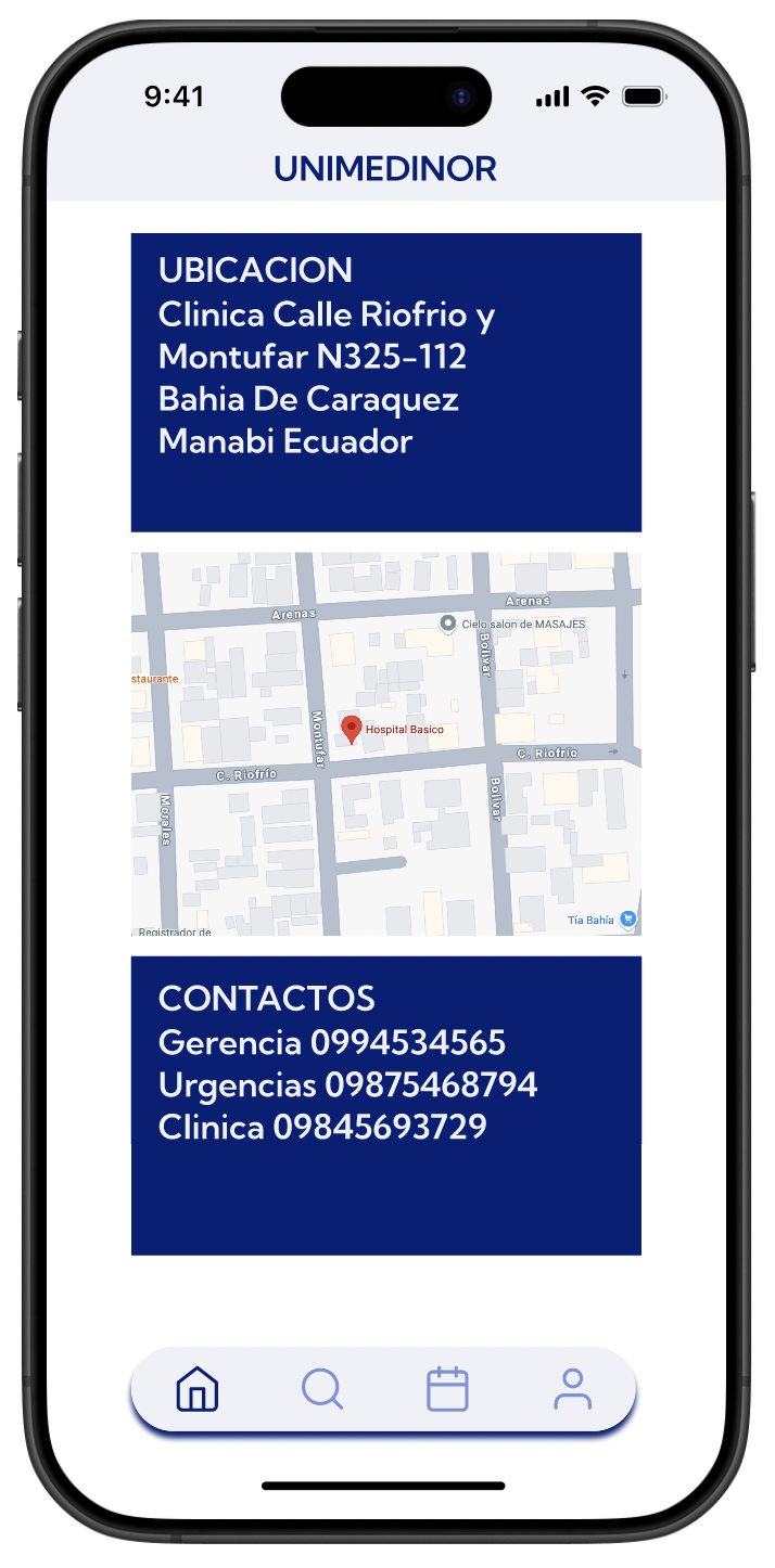
Urgent care location needed to be visible the moment the app opened. In an emergency, no one has time to search.
Mockup
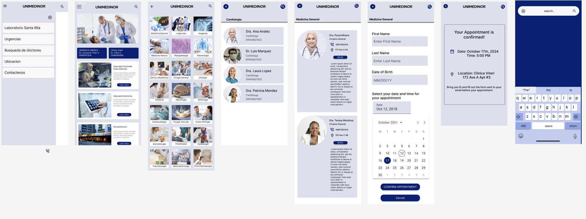
Before usability study
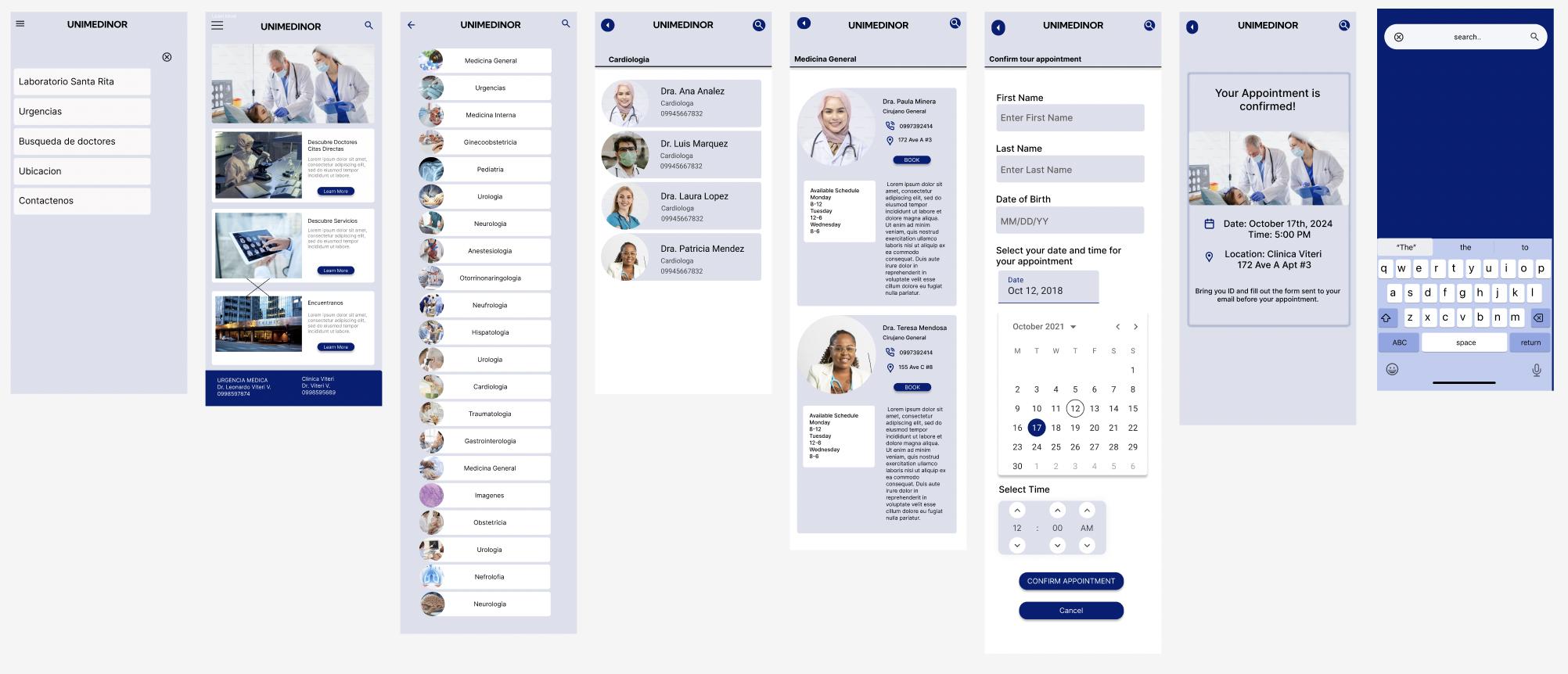
After usability study
The usability study made three things clear: add doctor photos, organize specializations with filters, and surface urgent care information immediately on the home screen.
The before and after speaks for itself. Every change was driven directly by what users needed, not by aesthetic preference.
Accessibility Considerations
1
High color contrast throughout the app, with a deep navy primary color, ensures text is readable in bright outdoor light, which matters in a coastal town where people check their phones outside.
2
Clear heading structure supports screen readers and makes navigation predictable for users who aren't familiar with apps.
3
Multiple input methods, including voice search, dropdowns, and keyboard navigation, mean users can complete tasks in whatever way feels most natural to them.
Takeaways & Next Steps
Impact
This app gives UNIMEDINOR Clinic something it never had before: a presence. Patients can now find the clinic, understand its services, and make informed decisions before ever walking through the door. For Pedro, it means his phone stops being the clinic's only communication channel. For Mariana, it means one less trip made on hope alone.
Next Steps
Test the app directly with patients in Bahia, Ecuador to validate usability with the actual target audience.
Add a cost transparency feature so patients like Mariana can see service prices before their visit.
Explore a lightweight notification system for walk-in availability so spontaneous visits become more predictable.